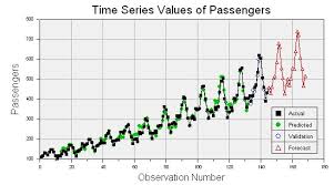
The Power of Visual Analytics
Visual analytics is a powerful tool that combines data analysis with interactive visualisation to help users understand complex datasets more easily. By representing data visually, patterns, trends, and relationships that might not be apparent in traditional numerical formats can be quickly identified and analysed.
One of the key benefits of visual analytics is its ability to present information in a way that is intuitive and easy to interpret. Charts, graphs, maps, and other visual elements can provide a clear overview of large datasets, allowing users to explore the data and gain insights at a glance.
Visual analytics is particularly valuable in fields such as business intelligence, finance, healthcare, and marketing where data-driven decisions are crucial. By leveraging visualisation techniques, organisations can extract meaningful information from their data and make informed decisions that drive success.
Interactive features in visual analytics tools enable users to drill down into the data, filter information based on specific criteria, and dynamically adjust visualisations to focus on areas of interest. This level of interactivity empowers users to explore data from different perspectives and uncover hidden insights.
Moreover, visual analytics promotes collaboration within teams by facilitating shared understanding of complex datasets. By presenting information visually in a format that is accessible to all stakeholders, organisations can foster better communication and alignment towards common goals.
In conclusion, visual analytics offers a transformative approach to data analysis by combining the power of visuals with advanced analytical capabilities. By harnessing the potential of visualisation techniques, businesses can unlock the full potential of their data assets and drive informed decision-making across all levels of the organisation.
Five Essential Tips for Mastering Visual Analytics
- Choose the right visualisation for your data to effectively communicate insights.
- Keep your visualisations simple and uncluttered to avoid overwhelming your audience.
- Use colour strategically to highlight important information and create emphasis.
- Provide clear labels and legends to ensure that viewers can easily interpret the visualisations.
- Interact with your visualisations by adding filters or tooltips for a more engaging user experience.
Choose the right visualisation for your data to effectively communicate insights.
Choosing the right visualisation for your data is essential to effectively communicate insights. By selecting appropriate charts, graphs, or other visual elements that best represent the underlying patterns and relationships in your dataset, you can convey complex information in a clear and concise manner. The choice of visualisation should align with the specific characteristics of your data to ensure that key findings are highlighted and easily understood by your audience. Whether it’s a bar chart for comparing values or a scatter plot for showing correlations, matching the visualisation to the nature of your data is key to maximising the impact of your analysis.
Keep your visualisations simple and uncluttered to avoid overwhelming your audience.
When utilising visual analytics, it is essential to maintain simplicity and clarity in your visualisations to prevent overwhelming your audience. By keeping your graphics clean and uncluttered, you can ensure that the key insights and trends are easily discernible, facilitating a more effective communication of data-driven information. Simplified visualisations not only enhance understanding but also engage the audience more effectively, allowing them to focus on the most critical aspects of the data being presented.
Use colour strategically to highlight important information and create emphasis.
When utilising visual analytics, it is crucial to employ colour strategically to draw attention to significant data points and enhance emphasis within the visualisations. By selecting appropriate colours that contrast effectively and convey meaning, users can quickly identify key information and trends within the dataset. Colour can be a powerful tool in guiding the viewer’s focus and highlighting critical insights, ultimately improving the overall comprehension and impact of the visual analytics presentation.
Provide clear labels and legends to ensure that viewers can easily interpret the visualisations.
To enhance the effectiveness of visual analytics, it is essential to provide clear labels and legends accompanying the visualisations. Clear labels help viewers understand the context of the data being presented, while well-defined legends provide key information about colours, symbols, or categories used in the visualisation. By ensuring that labels and legends are concise and easy to interpret, viewers can quickly grasp the meaning of the visualisations and derive valuable insights from the data presented. Clarity in labelling and legend design is paramount in facilitating effective communication and enabling viewers to make informed decisions based on the visualised information.
Interact with your visualisations by adding filters or tooltips for a more engaging user experience.
By incorporating interactive features such as filters and tooltips into your visualisations, you can enhance the user experience of your visual analytics. These interactive elements allow users to engage with the data more actively, enabling them to focus on specific aspects of the information presented and gain deeper insights. Filters help users refine their analysis by selecting relevant data subsets, while tooltips provide additional context or details when hovering over data points, making the visualisation more informative and engaging. By encouraging interaction through these features, you can empower users to explore the data in a more personalised and meaningful way, ultimately improving their understanding and decision-making processes.


